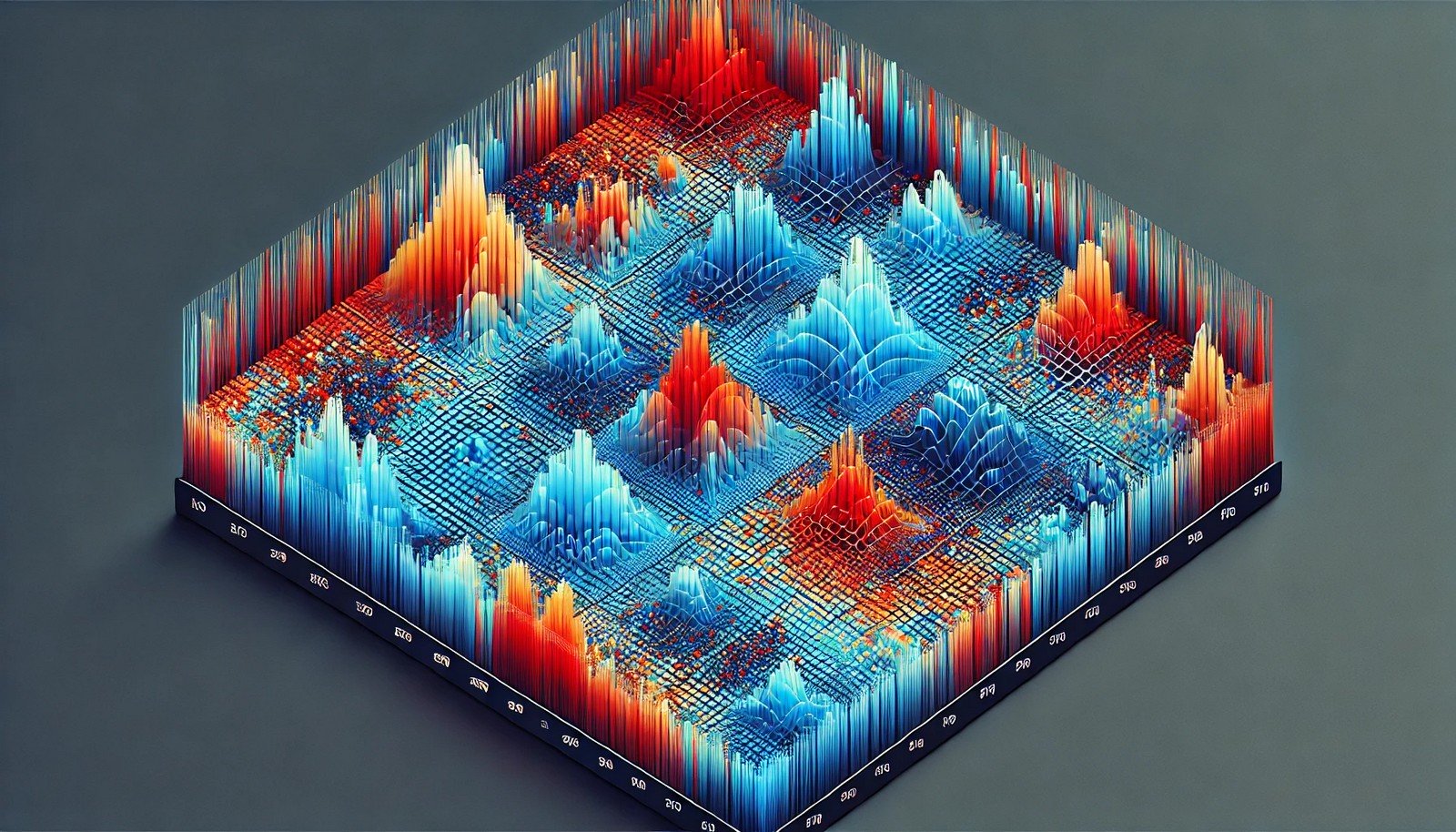
Heatmap Analysis
 (Representational Image | Source: Dall-E)
Quick Navigation:
- Heatmap Analysis Definition
- Heatmap Analysis Explained Easy
- Heatmap Analysis Origin
- Heatmap Analysis Etymology
- Heatmap Analysis Usage Trends
- Heatmap Analysis Usage
- Heatmap Analysis Examples in Context
- Heatmap Analysis FAQ
- Heatmap Analysis Related Words
Heatmap Analysis Definition
Heatmap analysis is a data visualization technique that represents data values as colors within a matrix or grid. It helps identify patterns, trends, and relationships in complex datasets. Commonly used in fields like web analytics, genomics, and financial analysis, heatmaps simplify data interpretation by visually emphasizing variations in data density, frequency, or magnitude. Tools like Tableau, R, and Python libraries (e.g., Matplotlib, Seaborn) are often used to create heatmaps.
Heatmap Analysis Explained Easy
Imagine you’re playing with a coloring book where different sections turn red if they’re hot and blue if they’re cold. A heatmap is like that coloring book, but for data! The more intense the color, the bigger or more frequent something is, making it easy to spot what's important at a glance.
Heatmap Analysis Origin
The concept of heatmaps traces back to the late 20th century, initially used in geographic information systems (GIS) to visualize data distributions on maps. It gained popularity in web analytics during the early 2000s for tracking user behavior on websites.
Heatmap Analysis Etymology
The term "heatmap" is derived from "heat," indicating intensity, and "map," which represents a spatial layout of data.
Heatmap Analysis Usage Trends
Heatmap analysis has become increasingly popular in data-driven industries. It is widely used in web analytics to track user clicks and interactions, in genomics for gene expression studies, and in finance for visualizing market movements. As data visualization continues to grow, heatmaps remain a key tool for simplifying large datasets.
Heatmap Analysis Usage
- Formal/Technical Tagging:
- Data Visualization
- Analytics
- Web Analytics
- Genomics - Typical Collocations:
- "heatmap visualization"
- "user interaction heatmap"
- "data density heatmap"
- "genomic heatmap analysis"
Heatmap Analysis Examples in Context
- A heatmap can show where users click most on a webpage, helping improve website design.
- In genomics, heatmaps display patterns in gene expression, aiding researchers in identifying significant genes.
- Financial analysts use heatmaps to visualize market trends, showing the performance of various assets over time.
Heatmap Analysis FAQ
- What is heatmap analysis?
Heatmap analysis is a data visualization method that represents data values as color variations within a matrix. - What are heatmaps used for?
They are used to identify patterns, trends, and outliers in data, commonly in web analytics, genomics, and finance. - How do you create a heatmap?
Tools like Tableau, Python’s Seaborn library, and Excel offer options for generating heatmaps from structured data. - What types of data are suitable for heatmaps?
Numeric and categorical data organized in a matrix form work best for heatmaps. - What is the difference between a heatmap and a choropleth map?
A heatmap shows data intensity without a geographical component, while a choropleth map is geographically based. - Are heatmaps useful for time-series data?
Yes, heatmaps can display time-series data trends by visualizing frequency or magnitude across time intervals. - How do heatmaps help in web analytics?
They help identify user engagement patterns on websites, highlighting areas with the most interaction. - Can heatmaps be interactive?
Yes, interactive heatmaps allow users to hover and explore detailed data points. - What is hierarchical clustering in heatmap analysis?
It’s a method to group similar data points in heatmaps, revealing patterns more effectively. - Is heatmap analysis applicable in marketing?
Yes, it is used to analyze customer behavior, optimize content strategy, and improve conversion rates.
Heatmap Analysis Related Words
- Categories/Topics:
- Data Visualization
- Analytics
- User Behavior
- Bioinformatics
- Finance
Did you know?
Heatmaps were initially developed for weather maps to depict temperature variations. Today, they’re extensively used to optimize websites and even help in sports analytics to track player movements on the field.
PicDictionary.com is an online dictionary in pictures. If you have questions or suggestions, please reach out to us on WhatsApp or Twitter.Authors | Arjun Vishnu | @ArjunAndVishnu

I am Vishnu. I like AI, Linux, Single Board Computers, and Cloud Computing. I create the web & video content, and I also write for popular websites.
My younger brother, Arjun handles image & video editing. Together, we run a YouTube Channel that's focused on reviewing gadgets and explaining technology.


Comments powered by CComment